

Choose the Right Font for Small Challenge Coins
Table of Contents
- Why Font Choice Matters for Small Challenge Coins
- Challenge Coin Font Size: What Actually Works
- Best Fonts for Challenge Coins: Typeface Selection
- Challenge Coin Text Layout: Placement and Spacing
- Readable Challenge Coin Design: Testing Before Production
- Keeping Text Concise: What to Include and What to Cut
- Common Font Mistakes to Avoid
- Frequently Asked Questions
Last Updated: October 12, 2026
Why Font Choice Matters for Small Challenge Coins
Choosing the right font for small challenge coins is one of the most overlooked decisions in custom coin design.
A beautiful script font looks stunning on screen but becomes a blurry mess at actual coin size. Bold, simple fonts work; thin, decorative ones don't.
The font determines whether your coin looks sharp or muddy and cheap. When a Marine holds a coin with their unit's name engraved on it, they want to read it clearly and see it look crisp.
Challenge Coin Font Size: What Actually Works
The ideal font size depends on the coin's diameter and how much text you need to fit. Most challenge coins range from 1.5 to 2 inches, so your text must work within those constraints.
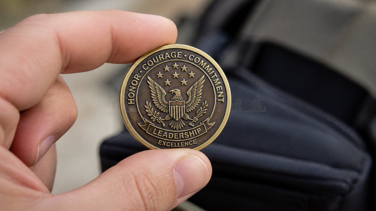
Minimum Readable Text Size
The absolute minimum readable text size on a challenge coin is 6-point font.
For most designs, aim for 8-point to 12-point font. This size stays clear at roughly 12 inches from the eye and survives metal striking better.
Spacing matters as much as size. Cramped text looks cheap and reads poorly, so give your letters room to breathe.
How Metal Striking Affects Fine Details
Metal striking creates your coin's raised lettering and relief details. A die hits the metal with tremendous force, filling small gaps and rounding off sharp edges.
Thin strokes and intricate details suffer first.
Fonts with consistent, medium-weight strokes hold up better because metal can't flow into thick strokes. That's why bold fonts work and thin fonts fail on challenge coins.
Best Fonts for Challenge Coins: Typeface Selection
Not all typefaces are equal for small coins. Four letterform traits decide legibility: stroke contrast, aperture, x-height, and counter size. Understanding them lets you judge any font before committing.
The Four Letterform Traits That Decide Legibility
Stroke contrast is the difference between a letter's thick and thin parts.
Aperture is how open a letter's gaps are.
X-height is the height of lowercase letters relative to capitals.
Counter size is the enclosed space inside letters like o, e, a, and p. Tiny counters clog during striking; generous counters stay open and keep letterforms distinct.
Sans-Serif Fonts for Maximum Clarity
Sans-serif fonts are your safest choice for challenge coin text.
These fonts are clean and simple, with no tiny details that disappear during metal striking, and a bold weight survives production beautifully.
Not all sans-serifs are equal. Grotesques like Helvetica and Arial have moderate stroke contrast and open apertures, making them reliable.
Serif Fonts: When They Work and When They Don't
Serif fonts have small strokes at the ends of letters. At large sizes, serifs guide the eye and add formality.
Traditional serifs like Times New Roman, Garamond, and Baskerville have thin hairlines and fine serifs.
If you want a serif look, choose a bold slab serif. Otherwise, stay with sans-serif.
Condensed Fonts: Fitting More Text Without Shrinking It
Condensed fonts squeeze each letter's width while keeping its height. Examples include Arial Narrow, Roboto Condensed, and Oswald.
The trade-off: condensed letterforms have narrower counters and tighter apertures that can fill in at very small sizes.
Use condensed fonts for a specific space problem, not as a default.
Why Decorative and Script Fonts Fail on Small Coins
Decorative and script fonts look elegant on screen but are terrible on challenge coins.
Script fonts mimic handwriting with thin, flowing strokes that connect.
Decorative fonts add flourishes and details that look beautiful at large sizes.
The rule is simple: if the font has thin strokes or lots of decorative details, it will fail on a small coin.
Bold Lettering Versus Thin Strokes
Font weight, how thick or thin the strokes are, determines whether your text survives production.
Bold fonts have thick, sturdy strokes.
Thin fonts have delicate strokes that read easily on screen but are fragile in production. Metal striking fills the spaces and rounds the edges, so thin strokes may disappear and text becomes a soft, blurry impression.
Choose a bold weight of your typeface. If your font has no bold weight, pick a different font. Bold lettering is essential for small challenge coins.
Challenge Coin Text Layout: Placement and Spacing
Where you place text and how you space letters matters as much as the font itself.
Letter Spacing and Line Spacing Essentials
Letter spacing is the distance between individual letters.
On a small coin, tight letter spacing makes text harder to read because letters run together.
Line spacing works the same way: with two lines of text, don't cram them together.
Good spacing makes text readable and the design look professional.
Balancing Text with Artwork and Design Elements
Your challenge coin has limited space. Text competes with artwork for that space.
Decide what's most important: artwork or text.
Curved text around the coin's edge is popular because it frames the main artwork and leaves the center clear.
Keep text concise. Every word you remove makes the rest larger and more readable, and short phrases beat long sentences on a small coin.
The best challenge coin designs balance bold, readable text with strong artwork. Neither element should overwhelm the other. Good spacing and clear fonts make both work together.
Readable Challenge Coin Design: Testing Before Production
You can't know how your design will look on the actual coin until you see a proof. Testing before production saves you from expensive mistakes. Here's a real method, plus the production and viewing variables that change the answer.
A Printable At-Scale Test You Can Run Today
A screen preview lies: your monitor renders text at whatever zoom you set and never shows how metal striking closes tight spaces. The fix is a physical test at final size.
- Set your design file to 100% scale and confirm the coin diameter matches your target (for example, 1.75 inches).
- Print on plain paper at 100% with no "fit to page" scaling, then verify the printed circle measures correctly with a ruler.
- Tape the printout to a wall at eye level and stand 12 inches away, the normal hand-held viewing distance.
- Read every line out loud. If you hesitate on any letter, it's too small or too tight.
- Step back to 24 inches and read again. Anything unreadable at 24 inches will be unreadable in a group setting.
- View the printout under dim light, not just overhead light. Coins get examined in bars, at ceremonies, and in parking lots, not on a design desk.
This test catches most problems before production, showing exactly how the text looks at actual size.
Checking Letterforms at Final Size
Use a magnifying glass or a zoomed phone camera to inspect the printed text closely.
Pay attention to the smallest letters, usually in a motto or date. Those fail first. If the smallest text is already marginal on the printout, it will be worse on the finished coin.
Production Variables That Change How Text Reads
Paper is not metal. Several production variables shift legibility in ways a printout can't show.
Relief depth. Raised lettering typically sits a few thousandths of an inch above the field.
Metal finish. A polished or proof finish reflects light and can wash out thin lettering.
Manufacturing tolerances. Dies wear: the first coins off a run are sharpest, and later coins lose detail.
Viewing Conditions and Accessibility
A font that reads perfectly in your hand at noon may fail for a 60-year-old veteran in a dim banquet hall.
Past a certain point, contrast matters more than size.
Viewing distance varies.
Eyesight varies too. Presbyopia, the age-related loss of near focus, typically begins in the 40s and makes small text harder to read regardless of font.
Proofing Your Design for Legibility
When you receive a proof from the manufacturer, inspect it carefully.
If the proof doesn't meet your standards, ask the manufacturer for adjustments, most will make changes or suggest alternatives.
A good proof catches issues paper testing might miss, showing exactly what the finished coins will look like.
A Simple Decision Workflow
Run these steps in order and you'll rarely ship a coin with unreadable text:
- Pick a bold sans-serif or bold slab serif that passes the four letterform traits.
- Cut copy to the essentials: unit name, branch, year, short motto.
- Set text no smaller than 8-point, with 10% to 20% extra tracking.
- Print at 100% scale and read at 12 and 24 inches under bright and dim light.
- Choose finish and enamel for contrast, not just looks.
- Request a proof and compare it to your printout before approving.
- Ask about relief depth and die wear if any text is marginal.
Keeping Text Concise: What to Include and What to Cut
Challenge coins have limited space for text. Every word counts.
Include the essentials: unit name, branch, year, or a short motto. Skip the rest.
One line beats two, and a short phrase beats a sentence.
Many military coins include just a name or unit designation. Some add a date or short creed.
Common Font Mistakes to Avoid
We see these mistakes repeatedly in challenge coin designs:
Thin fonts on small coins. The designer loves how the font looks on screen, ignores production warnings, and the proof arrives barely readable. Use bold fonts only.
Too much text. Designers try to fit the entire unit history onto a 1.75-inch coin.
Decorative fonts. Script, calligraphy, and ornamental typefaces look beautiful on a computer.
Poor spacing. Text crammed too close together or placed on top of artwork hurts readability.
Mixed font weights. Mixing thin and bold text in one design creates visual confusion.
Frequently Asked Questions
What font works best on a small challenge coin?
Sans-serif fonts like Helvetica, Arial, and Futura work best on small challenge coins because their clean, simple letterforms remain readable at tiny sizes. Bold sans-serif fonts are even better than thin ones, the extra weight prevents the letters from disappearing during metal striking. Avoid decorative, script, and serif fonts; their fine details and thin strokes blur or fill in completely when reproduced on a small coin surface.
How small can challenge coin text be and still be readable?
Text smaller than 6-point font becomes difficult to read on coins under 1.75 inches in diameter. For a 1.5-inch coin, 8-point bold text or larger is safer. At actual coin scale, hold a proof at arm's length, if you strain to read it, your coin's audience will too. Metal striking compresses fine details, so plan for 1-2 points larger than you think you need. Test your design at actual size before production.
How much text should you put on a small challenge coin?
Keep text short and essential. A name, unit designation, date, or short creed works well; full paragraphs do not. Dense text crowds the design and forces smaller font sizes, killing readability. Balance text with artwork and negative space. For a 1.75-inch coin, 10-15 words maximum is a good rule. Every word should earn its place, cut anything purely decorative.
How can you check whether challenge coin text will be legible before production?
Request a vector proof from your designer and print it at actual coin diameter. Hold it at arm's length under normal lighting, this simulates how people view coins. If text blurs or feels cramped, adjust font size, spacing, or copy length before sending to production. Ask your coin manufacturer for a sample strike or high-resolution mock-up showing how metal striking will render the fine details. This step catches legibility problems before they become expensive mistakes.