

How to Avoid Common Challenge Coin Design Flaws
Table of Contents
- Why Challenge Coin Design Flaws Matter
- Challenge Coin Design Checklist: What to Review Before Production
- Challenge Coin Artwork Requirements: Technical Specifications That Matter
- Challenge Coin Text Readability: Sizing, Fonts, and Legibility
- Challenge Coin Proof Approval: Your Final Quality Gate
- Design Concept and Purpose: Starting Strong to Finish Strong
- Material, Finish, and Color Choices That Support Your Design
- Frequently Asked Questions
Last Updated: October 15, 2026
Why Challenge Coin Design Flaws Matter
Challenge coin design flaws like poor execution make a coin look cheap: details disappear, text becomes illegible, and it fails to represent your unit or event.

This guide covers the technical specs, the proof approval process, and the production defects to watch for.
Challenge Coin Design Checklist: What to Review Before Production
Most design flaws are caught before artwork reaches a die, but most people review a coin like a poster, deciding whether they like it as a whole, missing the mechanical errors that ruin coins.
Work through this checklist in order and don't approve artwork until every line passes.
Stage 1: Content and Accuracy Flaws
These flaws cannot be fixed after production, a misspelled word or wrong date is permanent.
- Spelling, punctuation, and capitalization. Read every word backward, then forward, backward reading breaks pattern-completion. Check proper nouns against a primary source.
- Numbers and dates. Verify every numeral: years, unit numbers, hull numbers, squadron designations, anniversary dates. Transposed digits (1954 vs. 1945) are the most common uncaught error.
- Official names and designations. Confirm the exact official form, "101st Airborne Division" is not "101st ABN." Pull names from an official source.
- Mottoes and foreign-language text. Have a fluent reader verify spelling, accents, and diacritical marks, a missing accent can change meaning.
- Permission and authorization. If the design uses a branch seal, unit crest, or trademarked logo, confirm written authorization, unauthorized use creates legal exposure.
Stage 2: Legibility and Layout Flaws
These flaws survive on screen but fail at coin size.

- Text height. Measure the smallest text's cap height. Under roughly 2 mm for sans-serif and 2.5 mm for serif fonts risks filling in or blurring.
- Line weight. Check the thinnest stroke. Lines under roughly 0.5 mm tend to disappear or merge during striking.
- Edge clearance. Confirm at least 2 mm between the outermost text or imagery and the rim. Anything closer risks distortion or clipping.
- Contrast. Convert the design to grayscale. If two adjacent elements become the same shade of gray, they won't separate on a finished coin, regardless of color choice.
- Visual hierarchy. Squint at the design. The most important element should still dominate. If everything competes equally, nothing reads.
Stage 3: Composition and Balance Flaws
- Cramped layout. Does the design use the full field, or crowd one area and leave dead space? Cramped designs read as noise.
- Off-center focal points. The primary emblem should sit at or near the center intersection, unless asymmetry is intentional.
- Obverse/reverse competition. Each side should tell its own story. If both feature the same emblem, one is wasted.
- Border and rim treatment. Confirm the border style (plain, rope, reeded, beaded) suits the coin's purpose and doesn't crowd the interior.
Stage 4: Production-Readiness Flaws
- File format and resolution. Confirm vector artwork (AI, EPS, PDF) or high-res raster at the required DPI. Low-res raster art is the top cause of blurry proofs.
- Color mode. Confirm CMYK, Pantone, or spot colors, RGB shifts unpredictably when converted.
- Enamel color count. Each additional color adds cost, and very small areas may not fill cleanly.
- Relief depth. Confirm the specified relief (typically 0.5 to 2 mm) suits the detail level. Deep relief with fine detail causes fill-in.
| Flaw Category | What to Verify | Failure Mode If Missed |
|---|---|---|
| Content | Spelling, dates, official names, permissions | Permanent, uncorrectable error on every coin |
| Legibility | Text height, line weight, edge clearance, contrast | Blurry or illegible details after striking |
| Composition | Hierarchy, balance, obverse/reverse relationship | Coin looks cluttered or amateurish |
| Production | File format, color mode, color count, relief depth | Proof rejected, rework costs, delays |
Who Should Review the Checklist
One reviewer isn't enough. Have three sign off: the person who commissioned the coin, someone unfamiliar with the project (to test whether the design communicates alone), and someone who will carry the coin (to test feel and legibility).
Challenge Coin Artwork Requirements: Technical Specifications That Matter
A beautiful design in Adobe Illustrator can still fail if the file format or resolution doesn't meet manufacturing requirements.
Line Width and Detail Minimums
This is where most designs break: thin lines disappear and fine details blur.
Minimum line width for most coin manufacturing is 0.5 millimeters (about 1/50th of an inch); thinner lines disappear or blend during stamping and finishing.
Minimum text stroke weight is typically 1 point (1/72nd of an inch).
A complex background with dozens of small elements reads as visual noise on a 1.5-inch coin. Simplify: bold elements survive manufacturing, delicate ones don't.
Spacing and Composition Guidelines
Leave breathing room around text and imagery, cramped designs look unprofessional and read poorly.
Minimum spacing between text and the coin's edge is 2 millimeters; text closer to the rim becomes distorted or cut off.
If your coin has obverse (front) and reverse (back) sides, ensure the designs don't compete.
For coins with relief (raised or recessed areas), depth should be 0.5 to 2 millimeters.
Challenge Coin Text Readability: Sizing, Fonts, and Legibility
Text that looks readable on screen often fails on a finished coin.
Choose fonts with clear letterforms. Avoid decorative or script fonts unless bold and widely spaced, thin, ornate fonts become illegible at coin size.
Contrast is essential: dark-on-light and light-on-dark both work, but text only slightly darker or lighter than the background is hard to read in poor lighting.
Test text at actual size: print it at 1.5 inches and read it from arm's length. If you struggle, so will your customers.
Challenge Coin Proof Approval: Your Final Quality Gate
The proof is your last chance to catch flaws before full production, and the step most buyers rush because the coin finally looks real. Approval is binding: once the die is cut, corrections are expensive or impossible.
A disciplined workflow has four stages: digital proof review, revision request, physical proof inspection, and written final approval. Skipping any stage lets flaws reach production.
Stage 1: Digital Proof Review
The manufacturer typically sends a digital proof first, a PDF or image showing the artwork as it will appear on the die. It's a rendering, not a photo, so treat it as a technical document.
Inspect the digital proof for:
- Text accuracy. Zoom to 200 percent or more and read every character, typos are cheapest to fix here.
- Spelling of proper nouns. Cross-check against source documents, not the proof itself.
- Layout and alignment. Confirm text is centered, borders even, and spacing as intended.
If the digital proof has errors, do not approve it "with notes." Request a corrected proof. A manufacturer who pressures you to approve a flawed proof is a warning sign.
Stage 2: Revision Request
Request revisions in writing and be specific. "The text looks off" isn't actionable; "the word 'Battalion' on the reverse is misspelled as 'Batallion'; please correct and resend" is.
US Army Ranger Challenge Coin →
A practical revision request includes:
- The exact location of the issue (obverse or reverse, and where on the coin).
- What is wrong (spelling, size, color, placement, missing element).
- The correction (correct spelling, color reference, or position).
- A deadline if you're working against an event date.
Keep a written record of every revision request and response. If a flaw you flagged appears in the final product, that record is your leverage.
Stage 3: Physical Proof Inspection
A physical proof (pre-production sample or strike-off) is an actual struck coin, not a rendering, this is where you catch flaws digital proofs can't show.
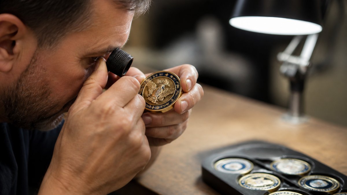
Inspect the physical proof systematically:
- Text legibility. Read every word at arm's length and up close. Check for fill-in, blurring, and uneven spacing.
- Image detail. Confirm fine details are visible and not merged, with no unintended roughness in recessed areas.
- Relief depth. Run a fingernail across raised and recessed areas, relief should feel consistent, not shallow in places and deep in others.
Stage 4: Written Final Approval
Only after the first three stages pass should you give final approval, in writing, referencing the specific proof version you're approving.
A complete final approval states:
- The proof version or date you're approving.
- Confirmation both sides were reviewed.
- Confirmation colors, finish, and edge treatment match your specification.
Don't approve production on a verbal "looks good." If a defect in the full run was present in the approved proof, the manufacturer may argue you approved it; a written approval referencing a specific proof version protects you.
Common Production Defects and How to Catch Them
Some flaws are manufacturing errors; others come from design choices that didn't translate to production.
Ghosting, faint, unintended images on the coin surface, usually results from incomplete die cleaning or worn equipment.
Misalignment means the reverse image is offset, creating an asymmetrical look.
Plating issues include uneven coating, discoloration, or base metal showing through.
If you spot any of these, don't approve production, request corrections in writing.
Design Concept and Purpose: Starting Strong to Finish Strong
The best challenge coin designs start with a clear purpose.

Ask: What is this coin meant to commemorate, a unit, ship, event, achievement, or religious or patriotic symbol?
Your answer should be immediately obvious to someone looking at the coin. If they need explanation, the design isn't clear enough.
Consider the audience: military personnel, collectors, and branch supporters have different expectations.
Material, Finish, and Color Choices That Support Your Design
Your design choices affect how the coin looks and feels.
Material choice determines durability and cost: zinc alloy is affordable and durable, brass offers a warmer tone, copper a distinctive reddish color.
Plating options include gold (popular for formal coins and awards), silver (classic), nickel (durable and affordable), and bronze (distinctive).
At US Troop Gear, Inc., we offer challenge coins like the US Army Ranger Challenge Coin at $16.95, demonstrating how material and finish choices create professional, durable coins. Each coin, from the 101st Airborne Division Challenge Coin to religious coins like the Put on the Whole Armor of God Challenge Coin, reflects careful attention to design clarity, material quality, and manufacturing standards.
The difference between a coin that looks cheap and one that commands respect comes down to planning.
Frequently Asked Questions
What are the most common challenge coin design flaws?
The most frequent flaws include text that's too small to read at actual coin size, lines thinner than 0.5mm that disappear during production, designs with insufficient contrast between elements, and artwork that doesn't account for the final coin's dimensions. Symbols and emblems that are too detailed or have poor spacing also cause legibility issues. Using a challenge coin design checklist before sending artwork to production catches most of these problems before they reach the manufacturing stage.
How can I make small text readable on a challenge coin?
Challenge coin text readability depends on three factors: minimum font size (typically 8-10pt for body text), font weight (bold fonts hold detail better than thin ones), and spacing between letters. Avoid serif fonts on coins smaller than 1.5 inches. Test your design at actual size on a printed mockup, then view it from arm's length. If you can't read it easily, neither will the final coin. Consider abbreviating text or using symbols instead of words when space is tight.
What should I check on a challenge coin proof before approving it?
Your challenge coin proof approval process should verify: text legibility at actual size, line integrity (no broken or faint lines), emblem and logo clarity, edge treatment quality, color accuracy if applicable, and overall composition balance. Check that all details match your approved artwork file and that no elements were accidentally removed or distorted. Request a physical proof if possible; digital previews can mask production issues. Ask your manufacturer about their revision policy before approving.
What artwork specifications do challenge coin manufacturers require?
Challenge coin artwork requirements typically include: minimum line width of 0.5mm, no text smaller than 8pt, vector files (AI or EPS preferred), 300 DPI resolution for raster images, and proper spacing between design elements (at least 2mm from edges). Avoid reversed text or overly thin decorative elements. Provide artwork in the exact coin dimensions and shape you've selected. Most manufacturers supply detailed technical guidelines; request these before you finalize your design to avoid costly revisions.